The Lowdown On The Artwork…
Hey guys
Well, you asked for it so here it is. This post does once again come with an Amber Geek-Alert. You have been warned…
Since I released my latest album [un]plugged a few weeks ago I’ve been getting a lot of questions about the artwork. This is the third release for which I’ve put together my own cover art. So for those of you that wondered; here’s the process I used this time.
Those of you that know me well or follow me on Instagram (@simonlittlebass) will be very much aware of my little obsession with iPhoneography; that is, the art and technology of iPhone-based photography and photo-editing. So it will not surprise you that the [un]plugged cover was almost entirely put together on my iPhone. Only the text was added separately using Gimp for Mac (a free and rather excellent image editing program), and that’s only because I haven’t found the right iPhone app(lication) yet…
1. I started out with an image of what is left of Gotham City Hall in Six Flags New Orleans. Hit by Hurricane Katrina in 2005, the site is set for demolition. I edited this image with the fantastic iPhone app(lication) Snapseed to give it a more gothic feel and darken the sky. I always start with the crop and auto-correct functions, then play about with the Tune Image settings and Drama filters. I think I may have also used the Tilt-Shift to add focus to the centre of the image. The first stage looked like this…
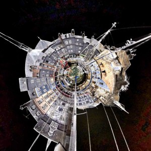
2. I then put this image through Tiny Planets. This is a fun little app(lication) that twists an image one of two ways into a circular pattern. I mess about with this a lot. The results are pretty haphazard at best and you have no real control over the final image but occasionally it comes up trumps. The resulting image looks like this:
3. It was at this stage that I transfered to my laptop and added the text to the bottom right corner. Gimp also allows use to match the colour of text with a colour from the image itself. I went with one of the grungy grays from the building.
4. I then immediately went back to the iPhone (!) and put this image through ScratchCam. This is an excellent app(lication) if you have time to fiddle with it and download all the extra filters (which are all free but not included in the initial download). I tend to use the random button to generate a few different options as a starting point and then edit in more detail from there. This is how I got the folded and torn look…
5. Now, as you can see here, the image became rather washed out in ScratchCam so I went back to Snapseed and essentially repeated the steps in mentioned earlier; mainly using the Tune Image and Drama functions to bring the colours out once more. The resulting image is the final cover art which we all know and love.
Hope this answers some of your questions regarding the artwork. I love the fact that you can manipulate images to this degree and sophistication on a mobile phone. I’ve been playing around with the applications a great deal over the last year and am only just starting to scratch the surface. As for the musical applications, well that is another post entirely…
Hope you’re all enjoying the album and don’t forget to tell your friends and help spread the word.
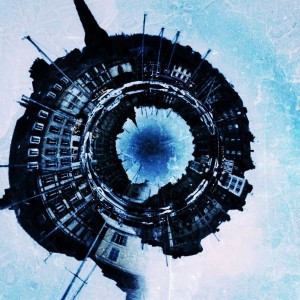
Just out of interest, here’s a couple of other images I put through Tiny Planets so you can get some idea of the possibilities. Out of the applications I use regularly, this one is the least consistent but often comes up with the most surprising results (Both these images were heavily edited in either Snapseed or Iris before being run trough Tiny Planets)…
Until next time…
![[un]plugged Image 1](http://www.simonlittlebass.com/wp-content/uploads/2012/05/IMG_1288-300x300.jpg)
![[un]plugged Art 2](http://www.simonlittlebass.com/wp-content/uploads/2012/05/IMG_1293-300x300.jpg)
![[un]plugged Art 3](http://www.simonlittlebass.com/wp-content/uploads/2012/05/photo-300x300.jpg)
![[un]plugged Artwork](http://www.simonlittlebass.com/wp-content/uploads/2012/04/unplugged-Artwork-Final1-300x300.jpg)

